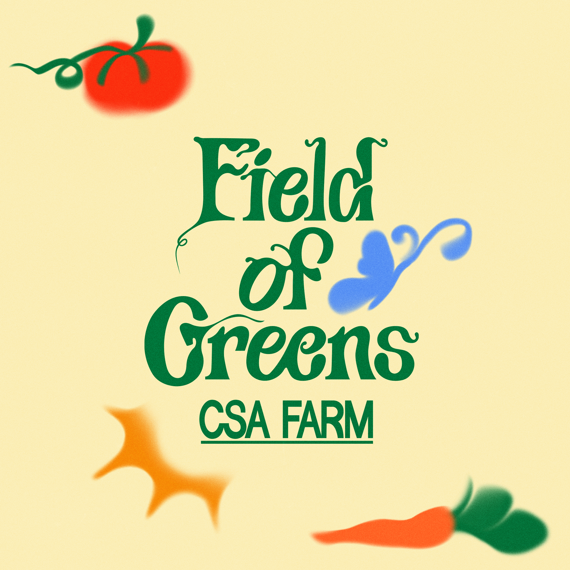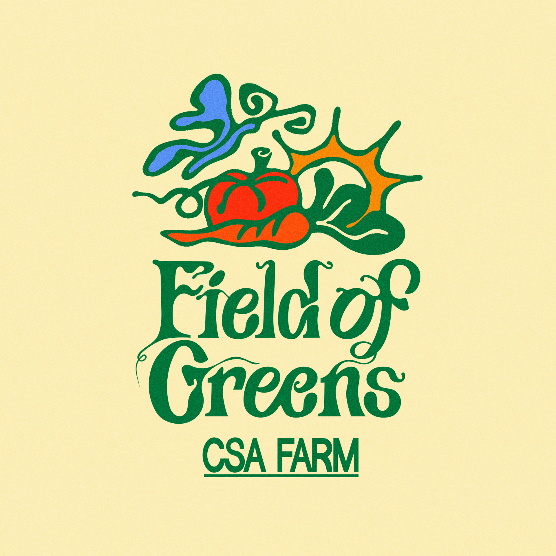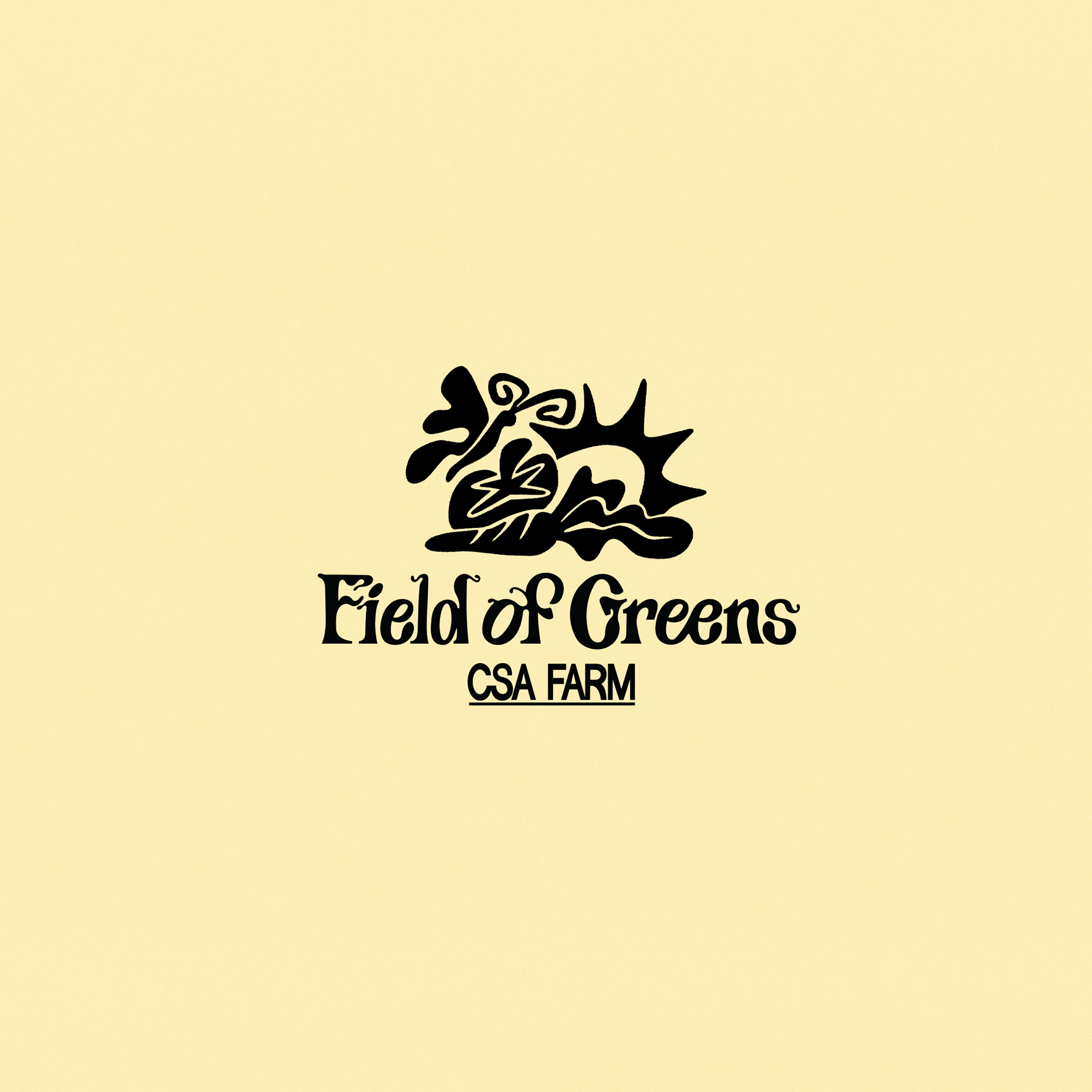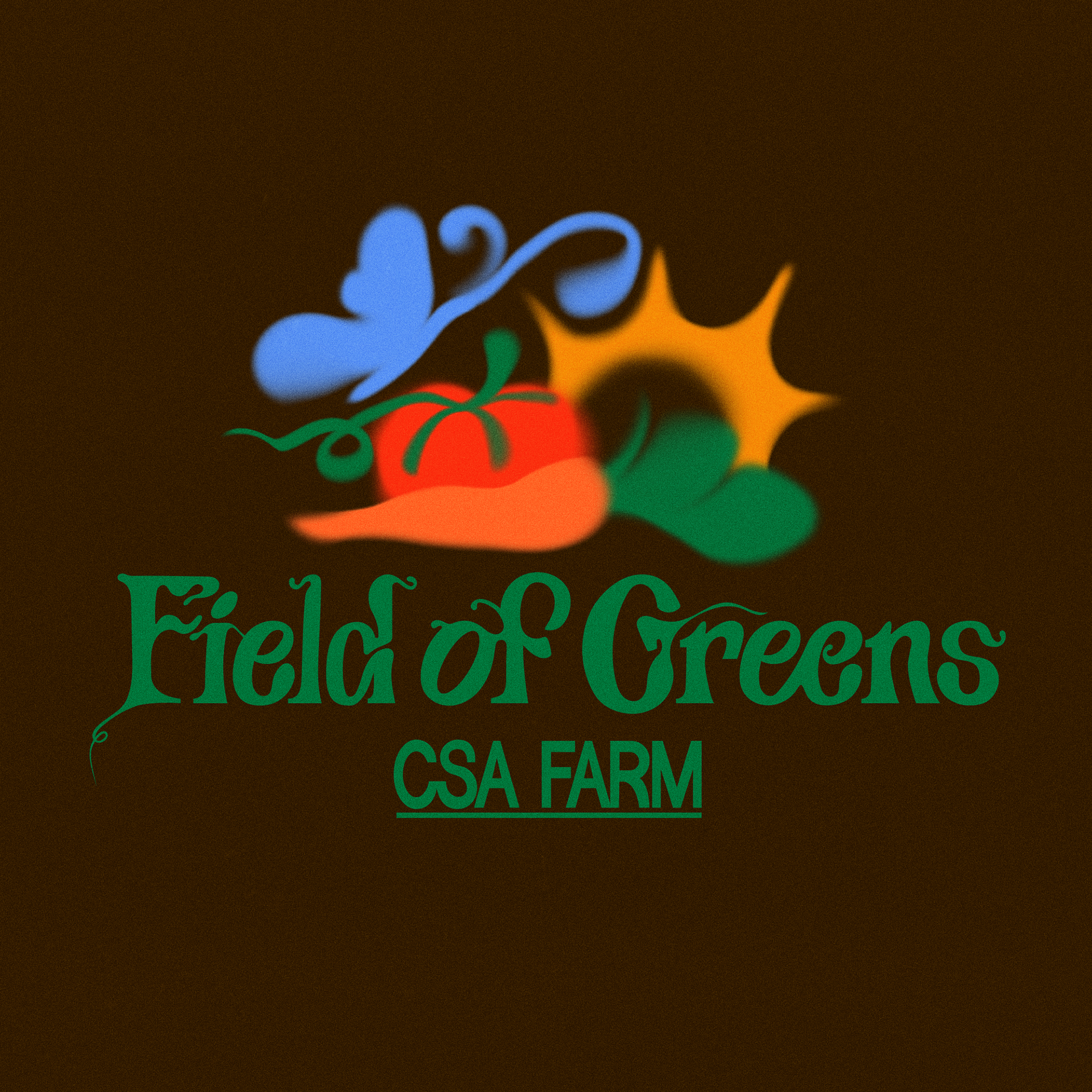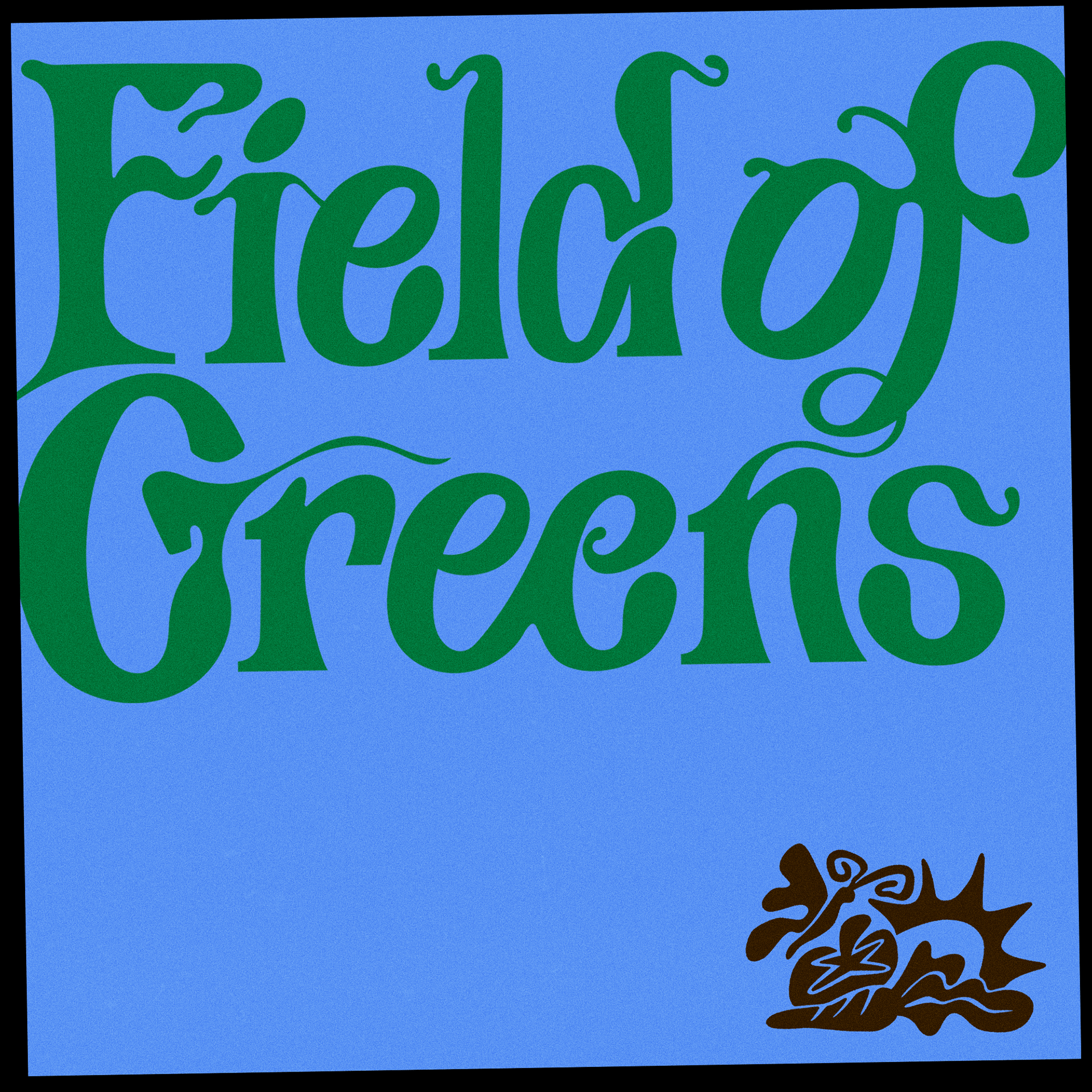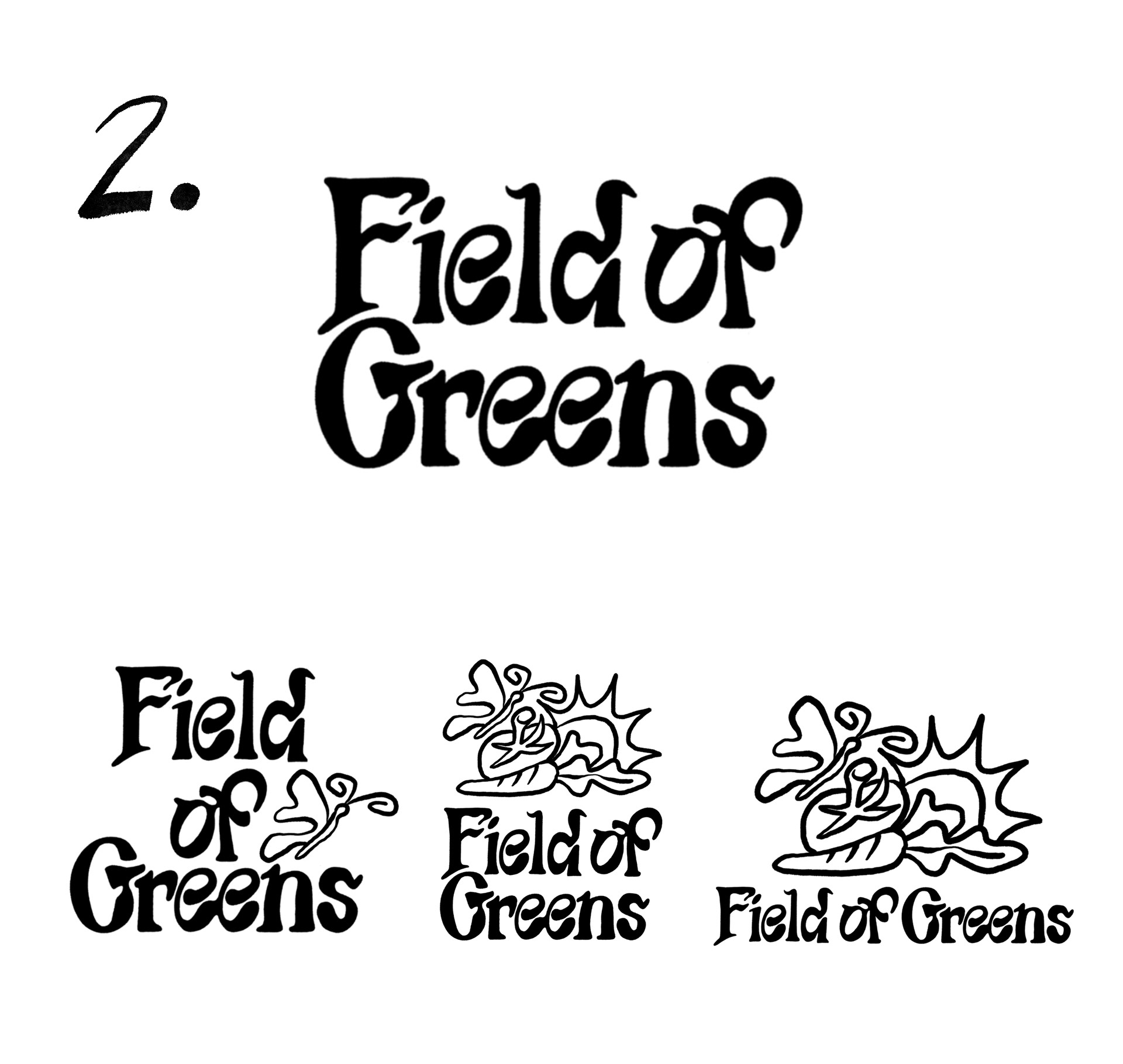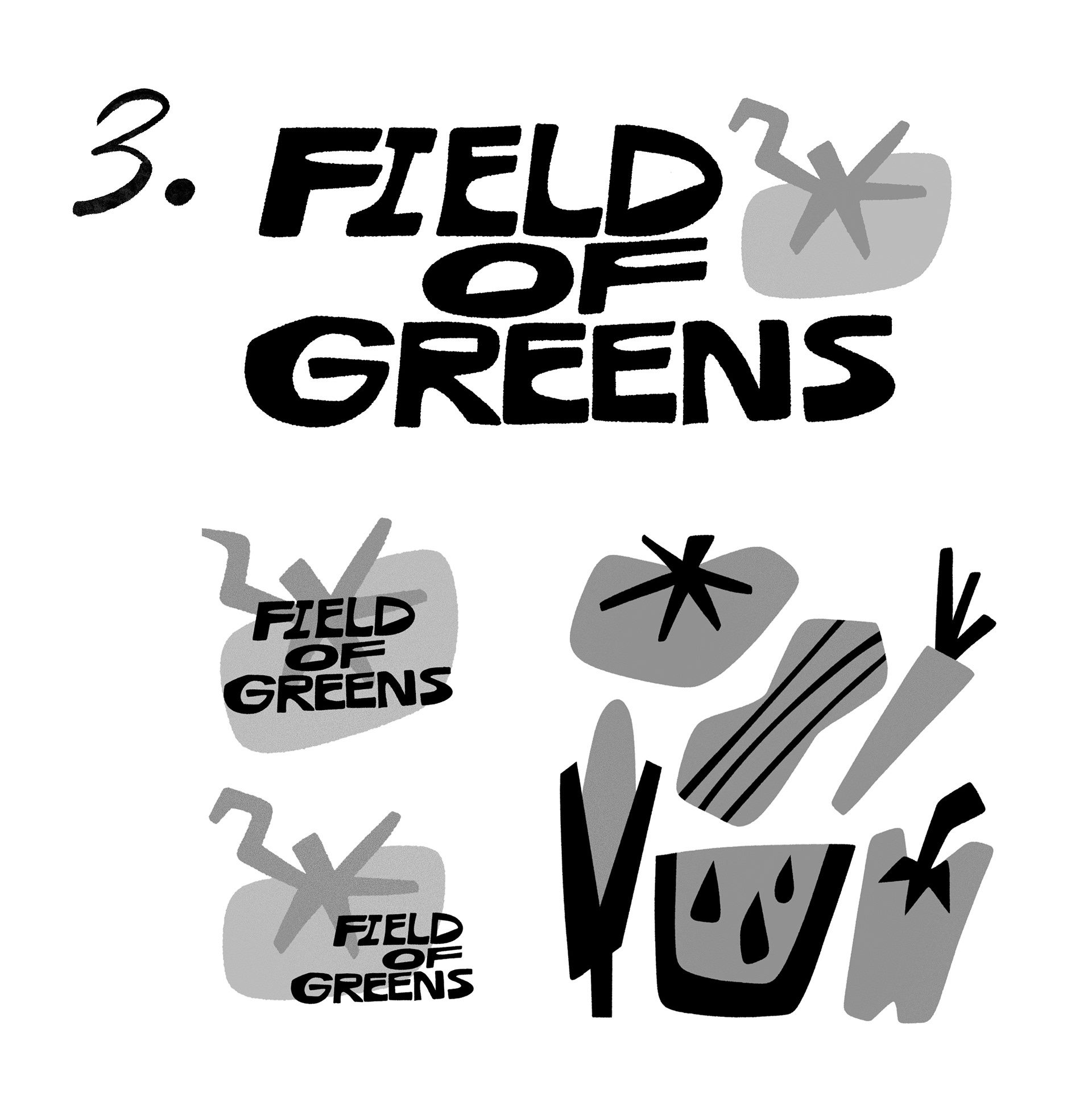
Branding project for a family friend — Field of Greens, a CSA farm.
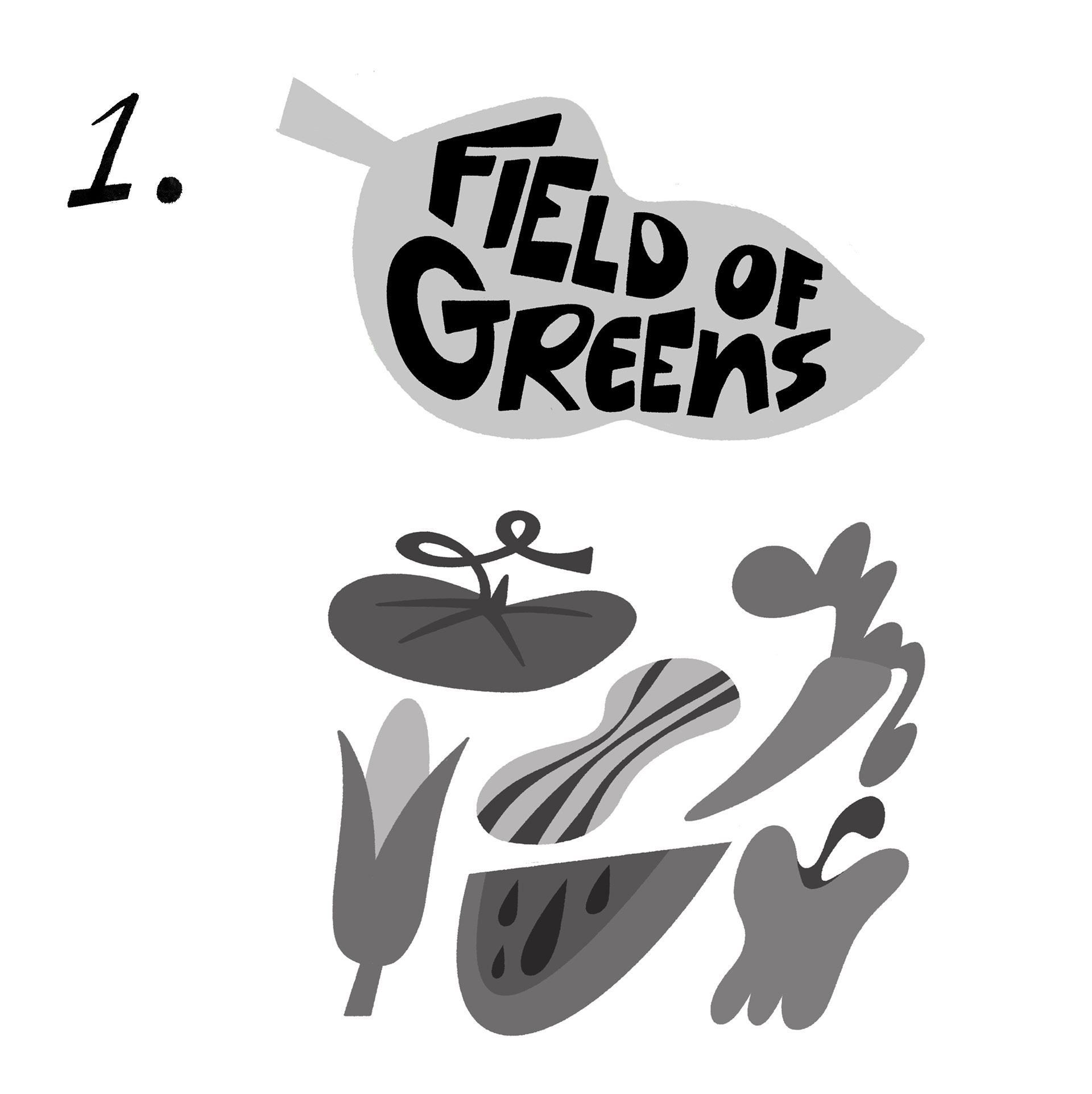
The logotype was hand lettered using a mix of traditional lettering elements and fun vine-like details to tie it back to farming and growth.
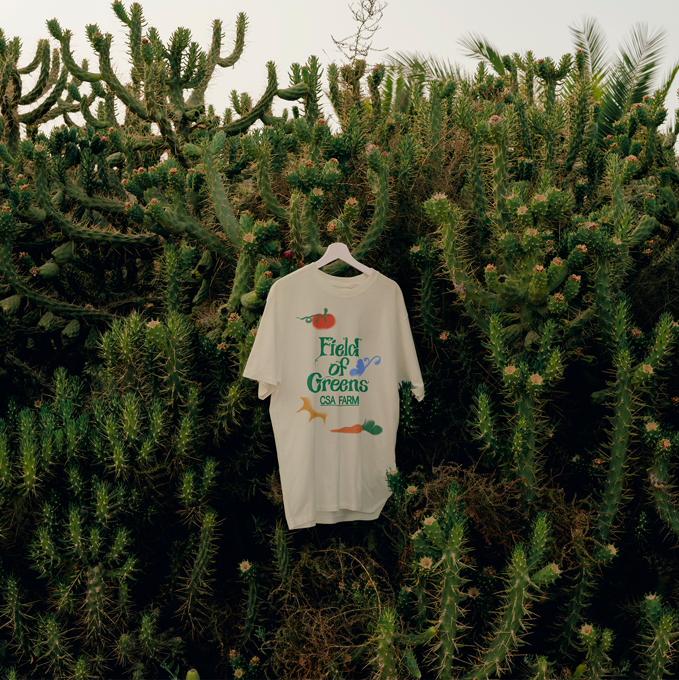
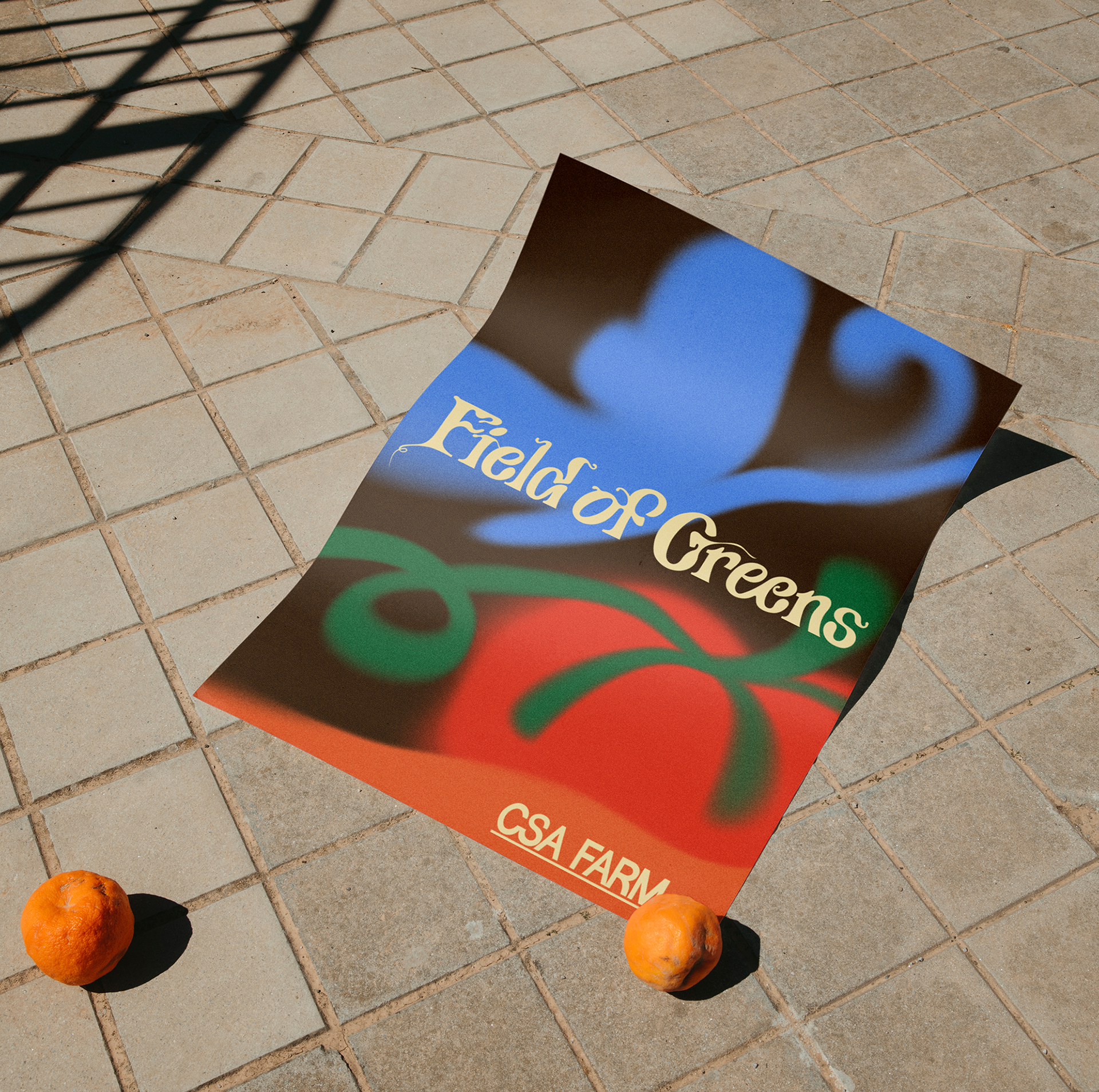
Illustrations were created to go alongside the typography. There ended up being two styles — One outlined version for practical use or at small scale, and the other being an airbrushed softer look which could be separated out or blown up.